via davidjcarr.files.wordpress.comIf you aren’t already, follow Mike on Tumblr. Completely brilliant feed.
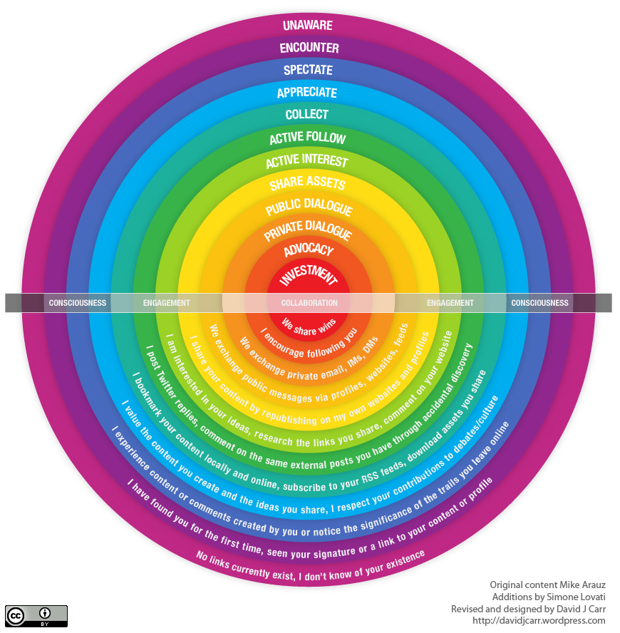
I have been working in this space - the participation threshold map - for the last few weeks and this is the best diagram I have come across for expressing a granular look at user types in online communities. Brilliant.
Previous
Previous
Next
Next